


In 2017 Greenery was the "Colour of the Year". Pantone created an extraordinary advantage for the plant production and retail business. Unfortunately the majority of companies did not use this typical plant colour in marketing and promotion activities. It is a real pity our industry is hardly using the great opportunities of the "Colour of the Year". It is so easy to establish colour ranges of various crops or varieties and making use of subconscious of the consumer.

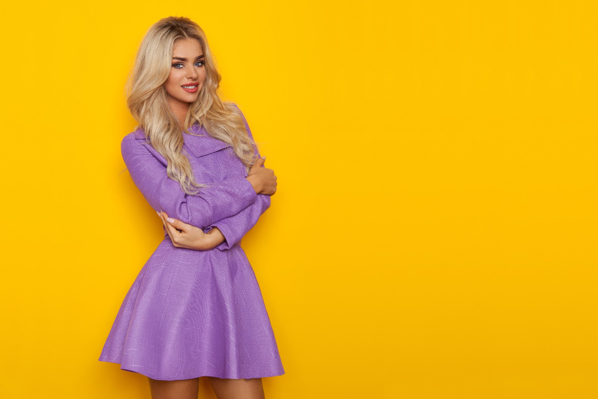
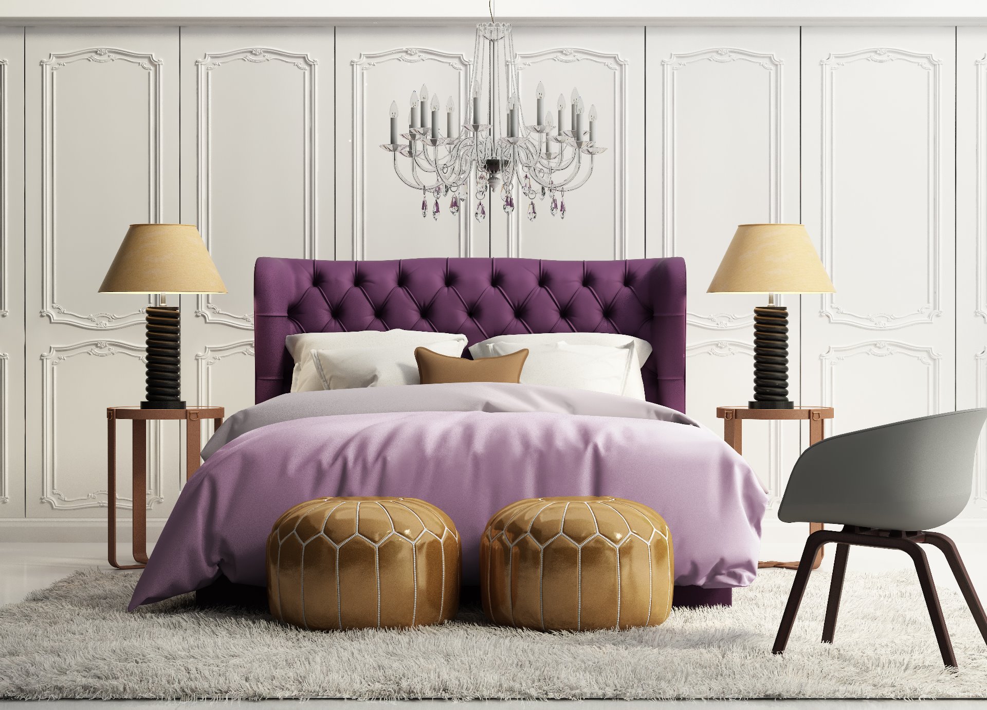
We look forward to recognise "Ultra Violet" everywhere
The objective of Pantone is always to mirror the developments of a society by choosing a colour that can reflect overall developments in a society. Pantone says "Ultra Violet" is complex and contemplative. Furthermore it suggests the mysteries of the cosmos, the intrigue of what lies ahead, and the discoveries beyond where we are now.
Just published some designers have been using the trends and created products of our daily live.


• mega-trends and value-trends
• design- and colour-trends
• garden-trends
How does the consumer colours receive? Are they meeting the attitude to life of the target group?
Do we have the expectation of better sales by utilising the "right colours"? It is very helpful to be aware the Pantone "Colour of the Year" and maybe to implement into concept developments.
It will be our pleasure to give you advises how you can perfectly reach your target audience. Maybe "Ultra Violet" will play a role in our conversation. We look very much forward to our next meeting.